Red Snapper - a professional makes a difference
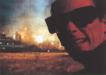
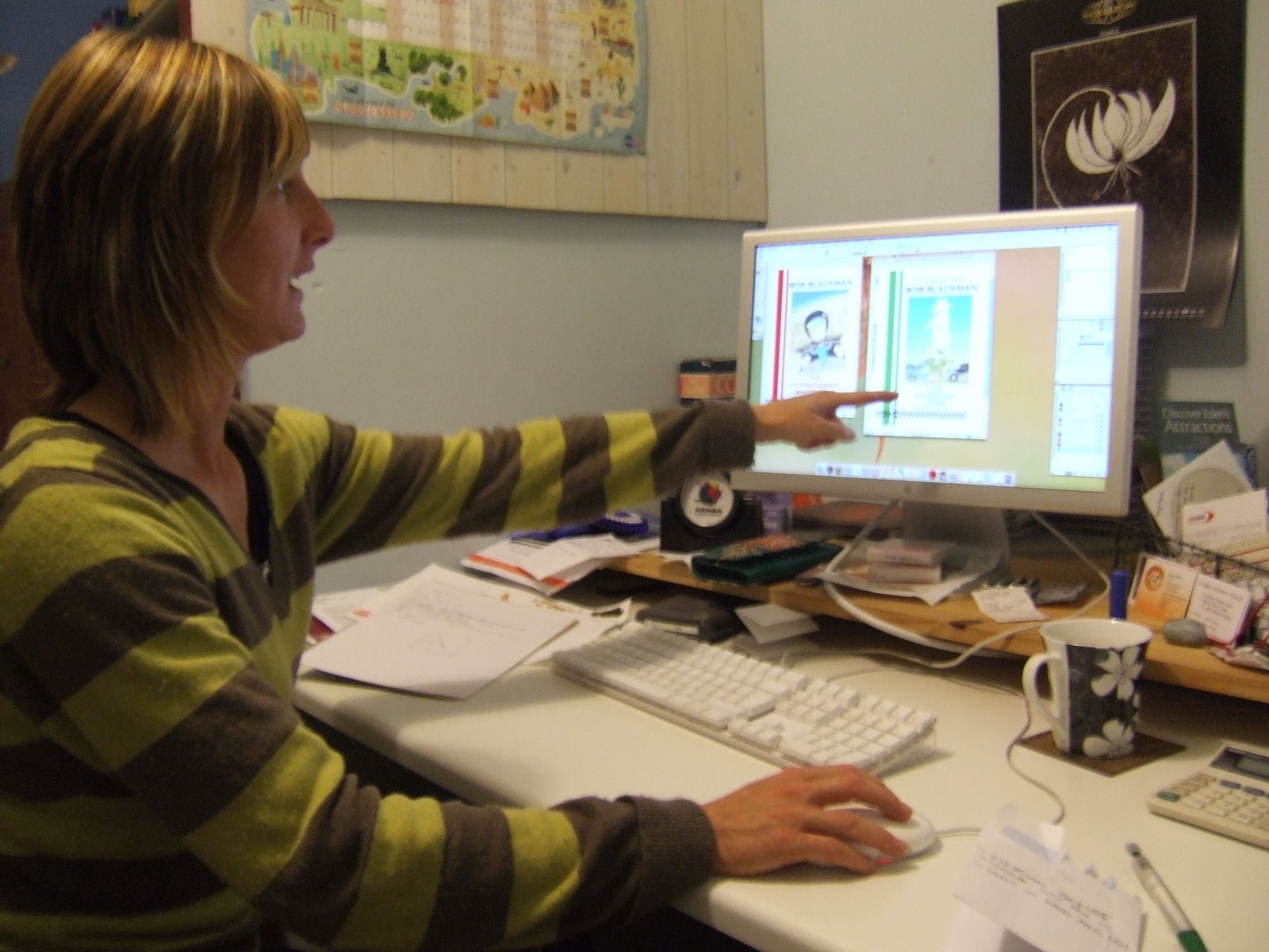 I had a good graphic design session with Rebecca Morton at Red Snapper last night. You'll have heard of Beck before on this blog. Dammit - you'll have eaten yoghurt from the pots she designed for Rachel's Organic Yoghurt and seen her work on the Milk Marque lorries. Here she is in action, pointing out something important I hadn't spotted. Of course, as soon as she'd shown me what was wrong it was obvious. She also showed me the amazing things the full verison of Photoshop can do. Well, some of them anyway.
 "Look how easily I can get rid of the blemishes," she said.
"What blemishes?" I replied. I'd been really careful not to get oily fingerprints on my work but there they were. And then there they were - gone. In the hands of an expert like Beck the results were frankly mind blowing - and so quick to make!
We've experimented with a couple of ideas but the favourite so far seems to be a refined version of that mugged together design that I cooked up. It's odd but anything with a larger picture seems to lose out in terms of impact. The white space around them seems to draw you into each illustration. That's how it works for me, anyway.
Beck said that we should be careful not to create any problems for the future. There needed to be sufficient space for longer titles and each cover illustration should follow the outline of a pyramid, which fortunately I seemed to be doing subconsciously. She really liked the new pictures - which pleased me no end since I really value her opinion - and said how much more coherent the pictures were. She neatly side-stepped my earlier problems with overlaying text on the illustration by simply separating them out.
We worked up cover versions(!) for both The Horsepower Whisperer and The Wormton Lamb and they looked really good. But Beck's only just getting started. She's going to work on them some more. I've asked to her to come up with some more suggestions. Go faster stripes are nice but not essential. It shouldn't take her long and I can't wait! All that patience I had when creating the illustrations has evaporated. entirely.
Labels: Photoshop, Red Snapper, The Horsepower Whisperer, The Wormton Lamb
posted by Bob Blackman at
00:00
2 Comments
Links to this post
![]()
![]()